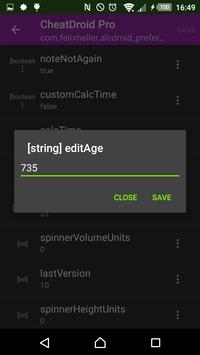
Cara Hack Fb Dengan Cheatdroid

Yt

Cara Hack Fb Dengan Mudah
Last week I covered many new features of JotForm 3.0 in screenshots. Today, I would like to talk about something different. Something I cannot capture in a screenshot.
Today, I’d like to talk about our philosophy for JotForm 3.0. I think these things are what separates JotForm from the rest of the crowd. We are glad that our upgrade rates are low Every other form builder forces their free users to have ads and their logo on their forms and emails. They also cripple features and limit users to number of questions and number of forms. We are disgusted by this general attitude on many web apps. They treat free users like shit.